Understanding Color Theory in Art: A Comprehensive Guide

Colour theory shapes everything from bold artwork to the calm in your living room, subtly guiding mood and meaning with every shade. The wild part is that colours are not just picked for beauty. They hold real power behind the scenes. Studies show colour choices can directly influence your emotions and even the way you experience a space. There is so much more to colour theory than picking what looks nice, and once you see how it works, you will never look at colour the same way again.
Table of Contents
- What Is Color Theory In Art And Its Fundamental Concepts?
- The Importance Of Color Theory: Why It Matters In Art And Design
- The Color Wheel: Understanding Primary, Secondary, And Tertiary Colors
- Color Harmony And Contrast: How Colors Work Together
- Practical Applications Of Color Theory In Art And Interior Design
Quick Summary
| Takeaway | Explanation |
|---|---|
| Understanding colour relationships enhances art | Mastering how colours interact allows artists to create visually compelling compositions that communicate emotions effectively. |
| Colour evokes specific emotional responses | Different hues influence viewer perception, with warm colours suggesting energy and cool colours implying calmness and tranquility. |
| Strategic colour selection impacts design | Designers can manipulate colours to create visual hierarchies and enhance user experiences across various creative fields. |
| Utilizing the colour wheel facilitates choice | The colour wheel provides insight into primary, secondary, and tertiary colours, aiding artists in making informed colour decisions. |
| Harmonies create visual balance and interest | By employing complementary, analogous, and triadic colour schemes, artists can enhance emotional resonance and aesthetic appeal in their work. |
What is Color Theory in Art and Its Fundamental Concepts?
Color theory in art represents a sophisticated framework of principles that guide artists in understanding how colours interact, communicate emotion, and create visual harmony. At its core, colour theory explores the scientific and aesthetic relationships between different hues, offering artists a strategic approach to colour selection and composition.
The Scientific Foundation of Colour
Colour theory is rooted in both scientific observation and artistic interpretation. It examines how humans perceive colour through light wavelengths and how different pigments interact when combined. Artists use this knowledge to manipulate colour strategically, creating depth, mood, and visual interest in their artwork.
The fundamental elements of colour theory include:
- Primary Colours: Red, blue, and yellow, which cannot be created by mixing other colours
- Secondary Colours: Green, orange, and purple, created by mixing two primary colours
- Tertiary Colours: Colours formed by mixing a primary and adjacent secondary colour
Psychological and Emotional Dimensions
Beyond technical understanding, colour theory explores the profound psychological impact of colours. Different hues evoke specific emotional responses and can significantly influence viewer perception. For instance, warm colours like red and orange often suggest energy and passion, while cool colours such as blue and green typically represent calmness and tranquility.
According to Interaction Design Foundation, colour selection is a critical aspect of artistic expression that transcends mere aesthetic choices. Artists strategically employ colour theory to communicate complex narratives, trigger emotional responses, and guide viewer interpretation of their work.
The Importance of Color Theory: Why It Matters in Art and Design
Color theory transcends mere aesthetic decoration, serving as a powerful communication tool that bridges artistic expression and psychological perception. By understanding the intricate relationships between colours, artists and designers can craft visual experiences that resonate deeply with audiences, conveying complex emotions and narratives through strategic colour selection.
Visual Communication and Emotional Resonance
Color theory enables creators to communicate without words, using hues as a universal language of emotion and meaning. Different colour combinations can evoke specific psychological responses, influencing viewer perception and emotional engagement. Professional artists leverage this understanding to guide audience interpretation, creating visual narratives that speak directly to human sensory and emotional experiences.
Key psychological impacts of colour include:
- Emotional Triggers: Red signaling passion or danger
- Cultural Symbolism: White representing purity in some cultures, mourning in others
- Attention Management: Bright colours drawing immediate visual focus
Strategic Applications Across Creative Disciplines
Color theory extends far beyond traditional art, playing crucial roles in graphic design, marketing, user interface development, and brand identity. Designers strategically employ colour principles to create visual hierarchies, communicate brand personalities, and enhance user experiences across digital and physical platforms.
According to Interaction Design Foundation, colour choices significantly impact user perception, with factors like cultural background, personal experience, and psychological associations influencing how individuals interpret visual information. Discover more about artistic color applications in our comprehensive guide to understanding colour’s transformative potential in creative expression.
The Color Wheel: Understanding Primary, Secondary, and Tertiary Colors
The color wheel serves as a fundamental visual tool in color theory, offering artists and designers a structured approach to understanding color relationships and interactions. This circular diagram represents the complex connections between different hues, providing insights into how colours can be combined, contrasted, and harmonized to create visually compelling compositions.
The Foundation of Color Categories
At the core of the color wheel are three distinct color categories that form the basis of all color interactions. These categories represent different levels of color complexity and provide artists with a strategic framework for color selection and mixing.
To help clarify the differences and relationships between primary, secondary, and tertiary colours, the table below categorizes and defines each type as discussed in the article.
| Colour Category | Colours Included | How They Are Created |
|---|---|---|
| Primary Colours | Red, Blue, Yellow | Fundamental hues, cannot be created by mixing other colours |
| Secondary Colours | Green, Orange, Purple | Created by mixing two primary colours in equal proportions |
| Tertiary Colours | Six intermediate colours (e.g. red-orange, blue-green) | Formed by mixing a primary colour with an adjacent secondary colour |
The primary color categories include:
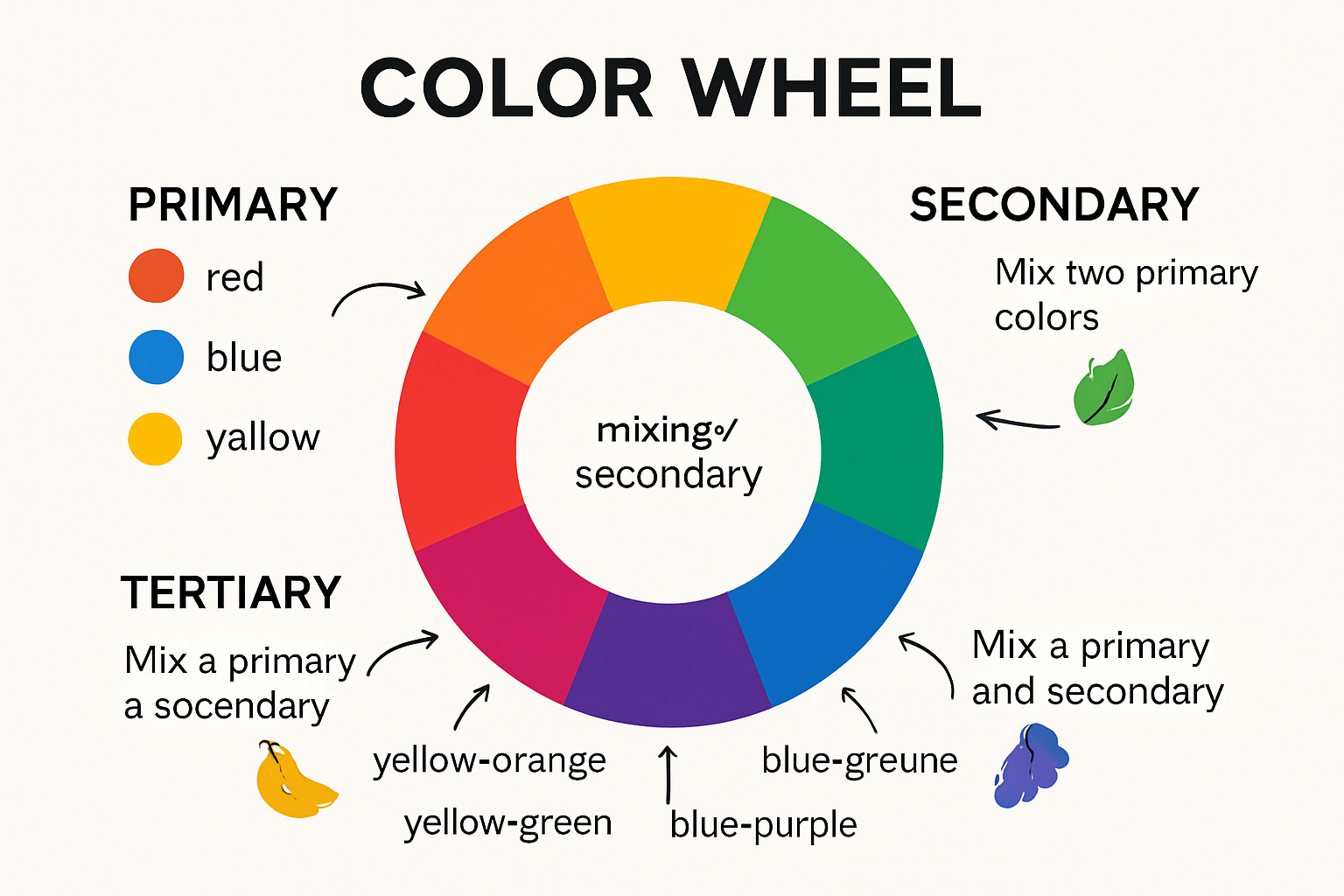
- Primary Colors: Red, blue, and yellow – the fundamental, pure colors that cannot be created by mixing other colors
- Secondary Colors: Green, orange, and purple – created by mixing two primary colors in equal proportions
- Tertiary Colors: Six intermediate colors formed by mixing a primary and adjacent secondary color
Color Relationships and Harmonies
Beyond basic categorization, the color wheel reveals sophisticated color relationships that artists can leverage to create visual depth and emotional resonance. Color harmonies such as complementary, analogous, and triadic schemes emerge from the wheel’s systematic arrangement, enabling creators to make intentional color choices that enhance artistic expression.
According to Sophia Learning, the color wheel is not just a theoretical construct but a practical tool that helps artists understand how different colors interact and influence each other. By studying these relationships, artists can develop more nuanced and sophisticated approaches to color selection and composition. Explore our guide on artistic color applications to deepen your understanding of color theory in visual arts.
Color Harmony and Contrast: How Colors Work Together
Color harmony represents the delicate art of combining colours in ways that create visual balance, aesthetic pleasure, and emotional resonance. Artists and designers strategically manipulate colour relationships to produce compositions that are simultaneously engaging, meaningful, and visually compelling.
Types of Color Harmonies
Colour harmonies are systematic approaches to colour combination that follow specific aesthetic principles. These established strategies help creators generate visually pleasing colour schemes that communicate effectively and evoke desired emotional responses.
Key colour harmony techniques include:
- Complementary Harmony: Using colours directly opposite each other on the colour wheel
- Analogous Harmony: Selecting colours adjacent to each other, creating a unified and serene effect
- Triadic Harmony: Combining three colours equally spaced on the colour wheel
Creating Visual Interest Through Contrast
Contrast is a powerful technique that adds depth, dynamism, and visual excitement to artistic compositions. By intentionally juxtaposing colours with different characteristics such as brightness, saturation, or temperature, artists can create focal points, guide viewer attention, and generate visual tension.
Effective contrast strategies involve understanding how colours interact and influence each other. Warm colours like red and orange can appear more vibrant when placed next to cool colours like blue and green, creating a dynamic visual dialogue that captures viewer interest.
According to Interaction Design Foundation, colour harmony is not just about aesthetic appeal but a sophisticated communication tool that influences perception and emotional response. Learn more about artistic colour applications in our comprehensive exploration of colour theory’s transformative potential.
Practical Applications of Color Theory in Art and Interior Design
Color theory transcends theoretical understanding, serving as a powerful tool for professionals across creative disciplines. Artists and interior designers leverage sophisticated color principles to create compelling visual narratives, evoke emotional responses, and transform spaces through strategic color selection and application.
Artistic Expression and Emotional Communication
In visual arts, color theory enables creators to communicate complex emotions and narratives without relying solely on representational elements. By understanding colour relationships, artists can craft compositions that guide viewer perception, create visual hierarchy, and invoke specific psychological and emotional states.
Key artistic applications of color theory include:
- Mood Manipulation: Using warm or cool color palettes to influence emotional perception
- Narrative Emphasis: Directing viewer attention through strategic color placement
- Symbolic Representation: Employing colors to represent abstract concepts or cultural meanings
Interior Design and Spatial Transformation
Interior designers utilize color theory as a sophisticated methodology for creating harmonious, functional, and emotionally resonant spaces. Color choices influence perceived room dimensions, emotional atmosphere, and human psychological responses. Professional designers carefully select color schemes that balance aesthetic appeal with psychological comfort, transforming ordinary spaces into extraordinary environments.

Color application strategies in interior design involve understanding how different hues interact with light, architectural elements, and human perception. Warm colors can make large spaces feel more intimate, while cool colors can create a sense of expansiveness and tranquility.
According to Interaction Design Foundation, color theory is a critical tool for creative professionals, enabling nuanced communication through visual language. Explore our insights on meaningful decor to understand how color choices can transform living spaces and artistic expressions.
Bring Colour Theory to Life With Extraordinary Local Art
The journey to mastering colour theory can feel overwhelming, especially when searching for real-world inspiration or guidance in applying those principles. Many artists and enthusiasts struggle to translate the ideas of colour harmony, emotional resonance, and visual balance into practice. This is exactly where Art Online bridges the gap. Our gallery features curated South African artworks that demonstrate powerful use of colour theory and storytelling through hue, offering a living portfolio of the techniques discussed in this guide.

Deepen your understanding of colour, explore authentic art that vividly showcases the use of primary, secondary, and harmonious colour schemes, and choose pieces that complement your own space or creative goals. Visit Art Online now to discover the richness and diversity of local talent and see for yourself how colour theory transforms a simple canvas into an evocative narrative. Don’t just study colour theory – experience it in action and make it part of your everyday environment. View our latest collection and start your journey toward more inspired living today.
Frequently Asked Questions
What is color theory in art?
Color theory in art is a set of principles that help artists understand how colors interact, communicate emotion, and create visual harmony. It encompasses the scientific and aesthetic relationships between different hues, guiding artists in their color selection and compositions.
Why is color theory important in art and design?
Color theory is crucial as it serves as a communication tool that bridges artistic expression and psychological perception. By understanding color relationships, artists and designers can create compelling visual experiences that resonate emotionally with audiences.
How does the color wheel assist artists in their work?
The color wheel is a visual tool that helps artists understand color relationships and interactions. It categorizes colors into primary, secondary, and tertiary groups, guiding artists in creating visually appealing compositions through harmonious color selections.
What are the different types of color harmonies?
Key types of color harmonies include complementary harmony (colors opposite each other on the color wheel), analogous harmony (colors next to each other), and triadic harmony (three colors that are evenly spaced on the wheel). These harmonies help create balanced and aesthetically pleasing designs.
Recommended
- Art Material Must-Haves: Transforming Cape Town’s Artists – Art-Online
- African Art Symbolism: Meaningful Decor for 2025 Homes – Art-Online
- What Is Landscape Art? A South African Perspective for 2025 – Art-Online
- Famous South African Artists: 2025 Guide for Collectors & Decorators – Art-Online
- Spot Colors Explained: How They Are Used in Printing