
How to Choose Wall Paint: A Step-by-Step Guide for 2025

Choosing the right wall paint can easily turn your living room from bland to breathtaking and even influence how you feel every day. Most people think it all comes down to picking a nice colour from a catalogue. Yet, the colour you choose can actually shift your mood and productivity, according to research from the University of Pretoria showing that paint colours profoundly affect emotional well-being. Once you realise your paint could set the entire vibe of your home, it changes how you look at that little paint sample in the shop.
Table of Contents
- Step 1: Identify Your Design Goals
- Step 2: Evaluate Lighting Conditions
- Step 3: Select An Appropriate Colour Palette
- Step 4: Test Paint Samples On Your Walls
- Step 5: Consider Finish Types And Durability
- Step 6: Finalize Your Choice And Make The Purchase
Quick Summary
| Key Point | Explanation |
|---|---|
| 1. Define your design goals clearly | Understand the room’s purpose and atmosphere you wish to create before selecting paint colors. |
| 2. Assess natural and artificial lighting | Observe how light changes colors in the room throughout the day; this significantly influences paint perception. |
| 3. Test large paint samples on walls | Apply sizable samples directly on walls to view colors accurately under varying light conditions. |
| 4. Choose the right paint finish | Consider the durability and cleaning needs of different finishes based on each room’s activities. |
| 5. Ensure quality and compatibility before purchase | Calculate paint quantity precisely and opt for high-quality products that fit your wall type for best results. |
Step 1: Identify Your Design Goals
Choosing wall paint is more than just selecting a color – it’s about creating an intentional atmosphere that reflects your personal style and functional needs. Before diving into color swatches and paint samples, you need a clear understanding of your design goals. This foundational step will guide every subsequent decision in your painting journey.
Start by thoroughly assessing the specific room and its unique characteristics. Consider the room’s primary purpose – is it a tranquil bedroom, an energetic home office, or a welcoming living space? Different areas require different emotional and practical approaches. A peaceful bedroom might call for soft, calming tones, while a home office could benefit from more stimulating colors that promote focus and productivity.
Next, evaluate the room’s existing elements. Take a critical look at your furniture, flooring, artwork, and architectural features. These elements will influence your color selection. A room with wooden floors and neutral furniture provides a versatile canvas, while spaces with bold, colorful furnishings might require more subdued wall treatments. Pay attention to natural and artificial lighting, as these significantly impact how colors appear and feel throughout the day.
Consider the psychological impact of color. Research from the University of Pretoria suggests that color choice profoundly affects mood and perception. Cool blues and greens can create a sense of calm, while warm yellows and oranges can inject energy and warmth into a space. Your design goals should align with the emotional experience you want to create.
Finally, document your observations and goals. Create a simple mood board or sketch that captures the room’s current state, desired atmosphere, and potential color palette. This visual reference will serve as your roadmap, helping you make confident decisions as you progress through the wall painting process.
Step 2: Evaluate Lighting Conditions
Lighting is the secret ingredient that can transform your wall paint from ordinary to extraordinary. Understanding how natural and artificial light interact with color is crucial in selecting the perfect wall paint that looks stunning throughout the day. Your chosen color will dramatically shift in appearance depending on the lighting conditions, making this step essential in your painting journey.
Begin by observing the room at different times of day. Natural light changes dramatically from morning to evening, and your wall color will look different under each lighting scenario.
Stand in the room during sunrise, midday, and sunset to see how sunlight influences the potential paint colors. North-facing rooms typically receive cooler, softer light, while south-facing spaces enjoy warmer, more intense illumination. This variation means a color that looks perfect in the morning might appear completely different by afternoon.
Evaluate your artificial lighting sources with equal scrutiny. Different types of light bulbs – LED, fluorescent, incandescent – emit varying color temperatures that can dramatically alter wall paint perception. Warm white bulbs with lower color temperatures create a cozy, yellowish glow, while cool white bulbs introduce a bluish cast. Research from the Oil and Colour Chemists’ Association confirms that spectral power distributions in lighting significantly impact color appearance.
To truly understand how your chosen colors will look, purchase small paint samples and create test patches directly on your walls. Apply these samples in different areas of the room, allowing them to sit for several days. Observe how the colors change under morning sunlight, afternoon brightness, and evening artificial lighting. Move around the room and view the test patches from various angles. This method provides the most accurate representation of how your final wall color will appear in your specific space.
Remember that reflective surfaces like mirrors, glossy furniture, and windows can also influence color perception. A light-colored wall might appear brighter near a large window, while the same color could seem darker in a corner with minimal light exposure. By carefully studying these nuanced lighting conditions, you’ll make an informed decision that ensures your chosen wall paint looks exactly as you envisioned.
Step 3: Select an Appropriate Colour Palette
Selecting a colour palette is more than randomly picking shades that catch your eye – it’s about creating a harmonious visual experience that reflects your personal style and enhances the room’s overall atmosphere. Your colour choices will set the emotional tone and functional character of the space, making this step critical in your wall painting journey.

Start by understanding the psychological impact of colours. Warm tones like terracotta, soft yellows, and rich oranges can create a sense of comfort and intimacy, perfect for living rooms and bedrooms. Cool tones such as sage green, soft blues, and lavender generate a sense of calm and spaciousness, ideal for home offices or relaxation areas. Consider the existing elements in your room – furniture, flooring, and architectural features – and choose colours that complement rather than compete with these elements.
Utilize colour wheel principles to create cohesive palettes. Complementary colours, located opposite each other on the colour wheel, create dynamic visual interest. Analogous colours, which sit next to each other, produce a more harmonious and subdued effect. For instance, a palette combining soft blues and greens can create a serene environment, while a combination of deep red and soft orange generates warmth and energy. The South African Paint Manufacturing Association recommends understanding the Natural Colour System to make more informed colour selections.
To test your colour palette, create a mood board that includes paint swatches, fabric samples, and images that represent the room’s desired aesthetic. This visual tool helps you see how different colours interact and whether they achieve the emotional and functional goals you established in earlier steps. Take time to observe these samples under different lighting conditions, remembering how light can dramatically transform colour perception.
Don’t be afraid to experiment with accent walls or subtle colour variations. A single wall in a bold, contrasting colour can become a stunning focal point, while using different shades of the same colour family can add depth and sophistication to your space. The key is balance – your colour palette should feel intentional, not accidental, creating a cohesive and inviting environment that truly feels like home.
Step 4: Test Paint Samples on Your Walls
Testing paint samples is a critical step that can save you from costly mistakes and ensure you’re completely satisfied with your color choice. This phase allows you to see how your selected colors truly perform in your specific space, accounting for unique lighting conditions and existing design elements that can dramatically alter color perception.
Start by purchasing large paint sample cards or painting small sections directly on the wall. Avoid tiny swatches that won’t give you an accurate representation of how the color will look when covering an entire wall. Purchase sample sizes from reputable paint brands and apply them in at least two different locations within the room. This strategy helps you understand how the color appears under varying light conditions and against different backgrounds.
Apply your paint samples carefully and strategically. Use clean, white poster board or paint directly on the wall, creating patches at least 60 centimeters square. Position these samples in areas with different lighting – near windows, in corners, and opposite light sources. This approach allows you to observe how natural and artificial light transform the color throughout the day. The South African Paint Manufacturing Association recommends examining these samples under multiple lighting conditions to ensure true color representation.
Observe your paint samples over several days, not just hours. Colors can look dramatically different in morning light versus evening illumination.
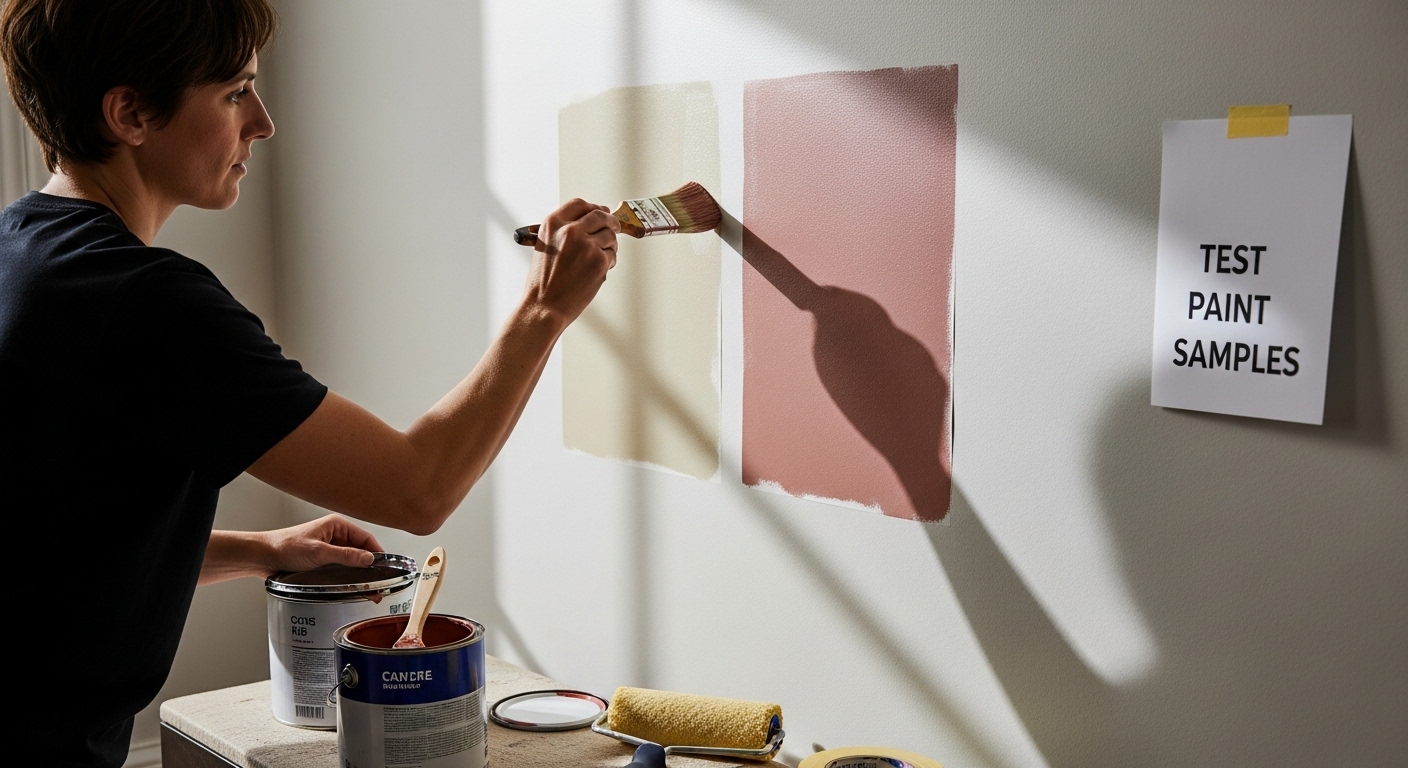 Take photographs of the samples at different times to compare and contrast. Move around the room, viewing the samples from various angles and distances. Pay attention to how the colors interact with your furniture, flooring, and other design elements.
Don’t rush this process. Live with the samples for at least three to five days before making a final decision. Sometimes a color that initially seems perfect might feel overwhelming or underwhelming after extended exposure. Trust your instincts, but also seek opinions from family members or design-savvy friends who can provide objective feedback. Remember, the goal is to select a wall color that not only looks beautiful but also creates the emotional atmosphere you desire in your space.
Step 5: Consider Finish Types and Durability
Selecting the right paint finish is just as crucial as choosing the perfect color. Different finishes not only impact the visual appearance of your walls but also determine their long-term performance, maintenance requirements, and ability to withstand daily wear and tear. Understanding these nuances will help you make an informed decision that balances aesthetic appeal with practical functionality.
Matte finishes offer a sophisticated, non-reflective surface that beautifully conceals wall imperfections. They’re ideal for low-traffic areas like bedrooms and formal living rooms, where elegance trumps durability. However, matte paints are less resistant to cleaning and can show marks more easily, making them less suitable for spaces frequented by children or high-activity zones. These finishes absorb light, creating a soft, understated look that can make rooms feel more spacious and calm.
In contrast, satin and semi-gloss finishes provide enhanced durability and easier maintenance. Satin finishes offer a subtle sheen that’s perfect for hallways, children’s rooms, and family spaces. They resist stains better than matte paints and can be gently cleaned without damaging the paint surface. Semi-gloss finishes take durability a step further, featuring a more pronounced shine that’s exceptionally easy to wipe down. These are excellent choices for kitchens, bathrooms, and areas exposed to moisture, grease, or frequent touching.
Consider the specific demands of each room when selecting your paint finish. High-humidity spaces like bathrooms and kitchens require finishes that resist mold and moisture. Hallways and children’s rooms need paints that can withstand frequent cleaning and occasional scuffs. The South African Paint Manufacturing Association recommends evaluating the functional requirements of each space before making a final selection.
Don’t be afraid to mix finishes within your home. You might choose a durable semi-gloss for trim and a matte finish for walls, creating visual depth and protecting high-contact areas. Always purchase high-quality paint from reputable manufacturers, as superior products offer better coverage, longer-lasting color, and improved durability.
Here is a comparison of common paint finishes, highlighting their features and best usage areas to help you make the right choice for each room:
| Paint Finish | Visual Appearance | Durability & Maintenance | Ideal Room Types |
|---|---|---|---|
| Matte | Non-reflective, soft | Conceals imperfections, less cleanable | Bedrooms, formal living rooms |
| Satin | Subtle sheen | Easy to clean, resists stains | Hallways, children’s rooms, family spaces |
| Semi-gloss | Noticeable sheen | Highly cleanable, moisture resistant | Kitchens, bathrooms, high-touch areas |
| Mix & Match | Varies (by area) | Custom performance per surface | Trim/semi-gloss, walls/matte for depth |
Step 6: Finalize Your Choice and Make the Purchase
With careful preparation and thoughtful testing complete, you’re now ready to transform your vision into reality. Finalizing your wall paint purchase requires strategic decision-making that goes beyond simply selecting a color and finish. This step is about ensuring quality, compatibility, and long-term satisfaction with your investment.
Begin by calculating the exact paint quantity needed for your space. Measure your walls precisely, accounting for total square meters and remembering to subtract areas occupied by windows and doors. Most paint brands provide coverage estimates on their labels, typically ranging from 10 to 12 square meters per liter. Purchase slightly more paint than calculated to account for potential touch-ups, uneven surfaces, or unexpected absorption. Professional painters recommend adding 10-15% extra to your initial calculation to ensure you have sufficient coverage.
Quality matters significantly when selecting paint. Invest in premium products from reputable manufacturers that offer superior pigmentation, durability, and coverage. While budget-friendly options might seem attractive, higher-quality paints often require fewer coats, provide better color retention, and offer longer-lasting finishes. Look for paints with built-in primer properties, which can simplify your painting process and potentially reduce overall material costs. Agrement South Africa recommends selecting products that meet national building and quality standards.
Before making your final purchase, confirm a few critical details. Check that your selected paint is compatible with your wall surface type – some formulations work better on plaster, others on concrete or previously painted surfaces. Verify the paint’s environmental credentials, looking for low-VOC (volatile organic compounds) options that minimize harmful emissions. Consider purchasing a small extra can for future touch-ups, ensuring color consistency if repairs become necessary.
Finally, gather all necessary painting supplies alongside your paint. This includes primer, brushes, rollers, painter’s tape, drop cloths, and protective gear. By preparing comprehensively, you’ll streamline the painting process and achieve a professional-looking result that reflects the careful consideration you’ve invested in selecting the perfect wall color.
To ensure a smooth wall painting process, use this checklist to confirm all steps and essentials are covered before you begin:
| Preparation Step | Completed (✔/✗) | Notes |
|---|---|---|
| Defined design goals | Assessed mood, function, existing decor | |
| Evaluated lighting conditions | Checked natural and artificial light | |
| Selected colour palette | Mood board or swatches prepared | |
| Tested paint samples on walls | Observed under different lighting | |
| Chosen paint finish & durability | Matched finish to room use | |
| Calculated quantity & purchased | Allow for extra paint and touch-ups | |
| Gathered painting supplies | Brushes, rollers, tape, drop cloths |
Finish Your Space with Art that Matches Your Dream Walls
You have carefully chosen the perfect wall paint by considering lighting, mood, colour palette and finish. Now your space is ready for the finishing touch that brings your vision to life. Many people search for ways to make their newly painted rooms feel truly special and personal after all their effort. Displaying the right artwork not only complements your chosen colours and atmosphere but also brings out the unique personality of your home.

Explore Art Online, South Africa’s largest online art gallery, and discover original pieces from renowned local artists that match your new wall colours and style. Transform your blank walls into inspiring focal points and enjoy a home that feels complete and inviting. Start browsing now and let the creative journey continue with artwork that celebrates your home’s fresh look. Visit Art Online’s homepage today and find the art that fits your newly painted space perfectly.
Frequently Asked Questions
How do I identify my design goals when choosing wall paint?
To identify your design goals, assess the room’s primary purpose, existing elements like furniture and lighting, and the emotional atmosphere you wish to create. This foundational understanding will guide your color selections.
What is the best way to evaluate lighting conditions for wall paint?
Observe the room at different times of day to see how natural light influences color appearance. Also, consider the type of artificial lighting used, as it can significantly alter how colors appear on your walls.
How do I create a cohesive color palette for my walls?
Start by understanding the psychological impacts of different colors and utilize color wheel principles. Consider existing elements in the room and create a mood board to visualize how the chosen colors will work together under various lighting conditions.
Why is testing paint samples on walls important?
Testing paint samples directly on your walls allows you to see how colors behave in your specific space over time and under different lighting conditions, ensuring you make an informed decision before committing to a final color.